
Troomi Design System
Bridging the gap between design and development.
When I joined Troomi as its UX designer, engineering already had reusable components in Storybook—but there wasn’t a corresponding UX design system. I created a Figma-based system that aligned with those existing components, creating a consistent foundation for designing and prototyping while establishing a shared language between UX and Engineering.
Role
Senior UX Designer
Focus
Design Systems · UI Design · Prototyping
Collaboration
Engineering · Product
Tools
Figma · Storybook
The challenge
Two sides of the same product.
Before I joined, developers were responsible for both designing and building the product. They already had reusable coded components in Storybook, but there wasn’t a design-side system I could use to create consistent interfaces and prototypes.
That created an opportunity: rather than inventing an entirely separate design language, I could build a system around patterns engineering already understood.
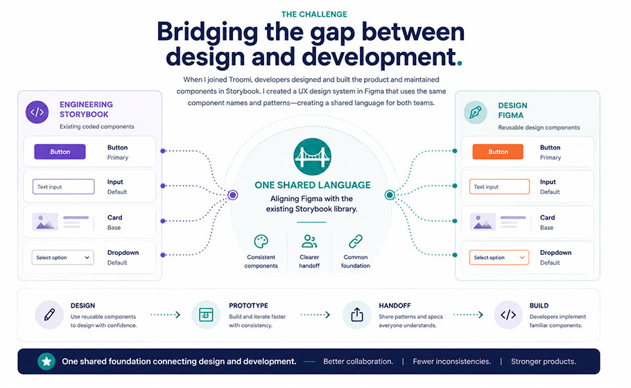
The goal wasn’t to replace the development system. It was to create the design side of it.
The Approach
One shared component language.
I used the existing Storybook library as a reference point when structuring the Figma system. Components were intentionally named to match the terminology developers already used, making it easier to communicate which patterns a design was intended to use.
The system created a clearer path from:
Design → Prototype → Handoff → Build
Building the Foundations
Creating consistency before creating screens.
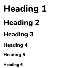
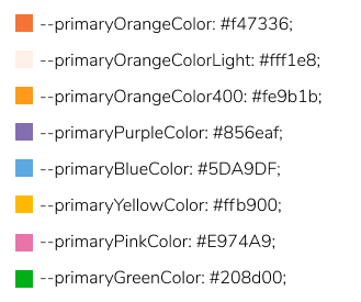
I established reusable foundations for typography, color, semantic states and interaction behavior so new product work didn’t require redefining basic UI decisions.
From Foundations to Components
Reusable pieces for repeatable experiences.
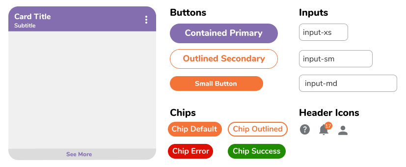
Once the foundations were established, I created reusable Figma components that corresponded with common patterns already available in Storybook.
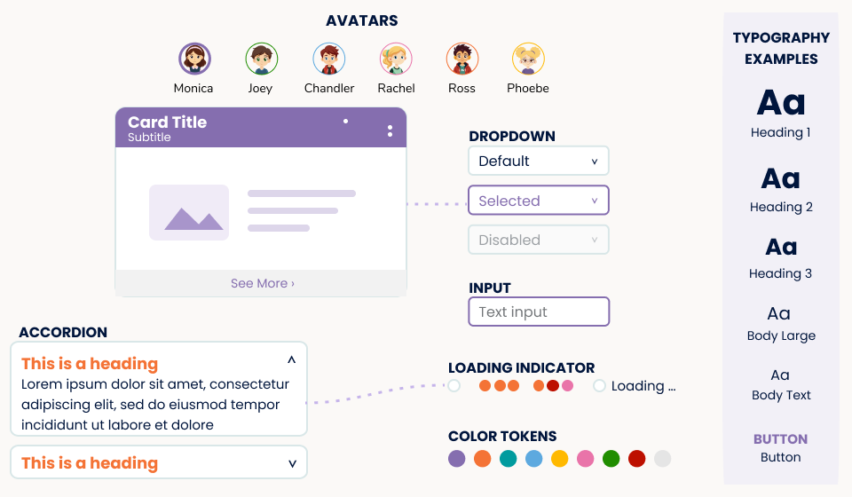
The component library included things like accordions, dropdowns, avatars, multiple button styles and states, pagination, progress indicators, toast messages, chips, tooltips, device selectors, field inputs and search patterns.
Designing for Real Product Patterns
A system that had to work beyond individual components.
Reusable components became the foundation for larger product patterns, including responsive navigation, cards, modals, content areas and data visualizations.
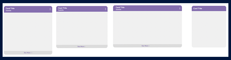
Flexible components, consistent patterns.
Card structures accommodated different content needs and layouts while maintaining a recognizable visual system.
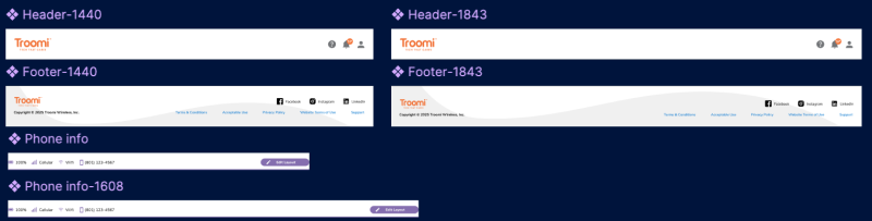
Designed across contexts.
Components and patterns were considered across desktop and mobile rather than as fixed, single-screen elements.
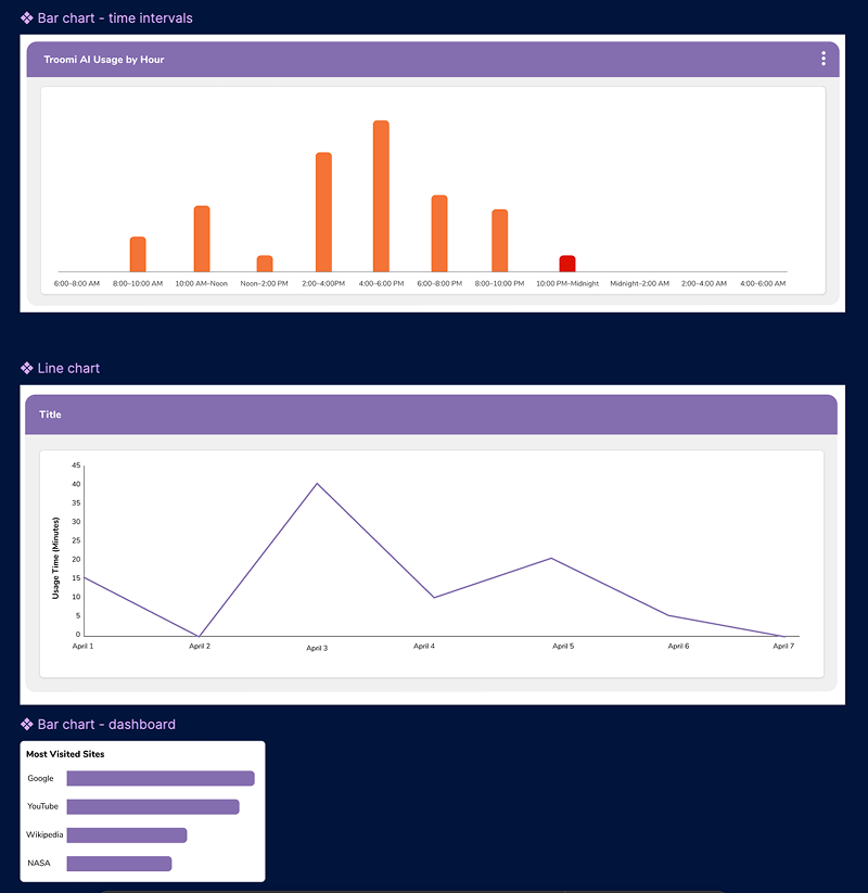
The Handoff
Designing in a language engineering already understood.
One of the most important decisions was naming Figma components to align with Storybook.
Instead of requiring developers to translate a new design vocabulary into code, designs could reference component patterns they already recognized.
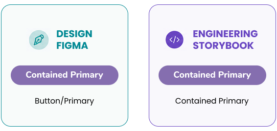
SHARED LANGUAGE
Shared terminology reduced ambiguity between what was designed and what developers were expected to build.
The Outcome
One shared foundation connecting design and development.
The design system created a reusable foundation for designing and prototyping new experiences while establishing a clearer connection between UX and Engineering.
By aligning Figma components, naming, and patterns with the Storybook library developers already used, designs required less translation during handoff. Engineering could more easily identify the intended components and patterns, supporting faster, more consistent implementation across the product.
The result was more than a component library. It created a shared language between design and development and a more scalable way to move product work from design into production.